Originally published in the Harvard Business Review available here.
Most managers know, anecdotally at least, that poor quality data is troublesome. Bad data wastes time, increases costs, weakens decision making, angers customers, and makes it more difficult to execute any sort of data strategy. Indeed, data has a credibility problem.
Still, few managers have hard evidence or any real appreciation for the impact of bad data on their teams and departments. They are thus unable to give data quality its due. To address this issue, in our teaching in executive programs in Ireland, we ask participants — executives that come from a wide range of companies and government agencies, and departments such as customer service, product development, and human resources — to develop such evidence using the Friday Afternoon Measurement (FAM) method.
The method is widely applicable and relatively simple: We instruct managers to assemble 10-15 critical data attributes for the last 100 units of work completed by their departments — essentially 100 data records. Managers and their teams work through each record, marking obvious errors. They then count up the total of error-free records. This number, which can range from 0 to 100, represents the percent of data created correctly — their Data Quality (DQ) Score. It can also be interpreted as the fraction of time the work is done properly, the first time.
We then ask executives to reflect on their results, explore the implications, and tee up improvement projects. Some are defensive and try to discount the results. But most are shocked, even horrified. “I’m really disappointed. Given the critical nature of this work, I expected to score much better,” is a typical reaction. Not surprisingly, many managers in our classes take immediate action to identify and eliminate the root causes of error.
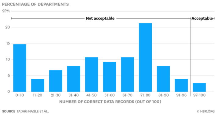
Over the past two years, we’ve taken 75 executives through this exercise. In so doing, we’ve collected 75 data quality measurements. They provide an opportunity to determine just how good — or bad — data quality really is. Our findings are illustrated in the figure below.
Our analyses confirm that data is in far worse shape than most managers realize — and than we feared — and carry enormous implications for managers everywhere:On average, 47% of newly-created data records have at least one critical (e.g., work-impacting) error. A full quarter of the scores in our sample are below 30% and half are below 57%. In today’s business world, work and data are inextricably tied to one another. No manager can claim that his area is functioning properly in the face of data quality issues. It is hard to see how businesses can survive, never mind thrive, under such conditions.Only 3% of the DQ scores in our study can be rated “acceptable” using the loosest-possible standard. We often ask managers (both in these classes and in consulting engagements) how good their data needs to be. While a fine-grained answer depends on their uses of the data, how much an error costs them, and other company- and department-specific considerations, none has ever thought a score less than the “high nineties” acceptable. Less than 3% in our sample meet this standard. For the vast majority, the problem is severe.The variation in DQ scores is enormous. Individual tallies range from 0% to 99%. Our deeper analyses (to see if, for instance, specific industries are better or worse) have yielded no meaningful insights. Thus, no sector, government agency, or department is immune to the ravages of extremely poor data quality.
The cost of these findings is difficult to predict with much precision. Still, most find a good first approximation in the “rule of ten,” which states that “it costs ten times as much to complete a unit of work when the data are flawed in any way as it does when they are perfect.” For instance, suppose you have 100 things to do and each costs a $1 when the data are perfect. If all the data are perfect, the total cost is 100 x $1 = $100. If 89 are perfect and 11 are flawed, the total cost is 89 x $1 + 11 x $10 = $199. For most, of course, the operational costs are far, far greater. And the rule of ten does not account for non-monetary costs, such as lost customers, bad decisions, or reputational damage to your company.
These results should scare all managers everywhere. Even if you don’t care about data per se, you still must do your work effectively and efficiently. Bad data is a lens into bad work, and our results provide powerful evidence that most data is bad. Unless you have strong evidence to the contrary, managers must conclude that bad data is adversely affecting their work.
These results should also stimulate action. As a first step, conduct your own FAM study. It is quick, simple, and powerful. Find out exactly where you stand. Ignorance of data quality issues is no longer an excuse.
Finally, these results suggest opportunity. While some data quality issues are unfathomably complex, many yield quickly and produce outsize gains. Eliminating a single root cause can prevent thousands of future errors, save millions, and make things better for all involved. You should use your FAM to seize at least one such opportunity.
Comments